
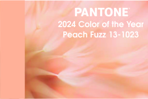
Every year, design experts and color forecasters eagerly await the announcement of the Color of the Year by various influential organizations. This selection often sets the tone for design trends across industries, including fashion, home decor, and even branding. But when it comes to practical spaces like grocery stores, designers are not quick to jump in on the trend. The designers at DSG are no exception.
Color plays a pivotal role in shaping our perceptions and emotions. It can influence our mood, behavior, and even our purchasing decisions. In the context of a grocery store, color psychology is particularly important as retailers strive to create environments that are inviting, soothing, and conducive to shopping.
By embracing the Color of the Year, a grocery store can take on a contemporary and trendy feel, signaling to customers that the establishment is up to date with current design trends. These colors can help draw attention to certain areas of the store, such as promotional displays or product highlights, thereby enhancing the overall shopping experience. For grocery chains looking to differentiate themselves from competitors, leveraging the Color of the Year can be a subtle yet effective way to stand out and create a unique brand identity.


Before jumping in with the trends however, you must also consider the downsides. While trendy colors may be visually appealing, they may not always be practical for a grocery store environment. Bold or overly vibrant hues could potentially clash with product packaging, making it harder for customers to locate items. Design trends come and go, and what is fashionable today may quickly become outdated tomorrow. Investing heavily in the Color of the Year could result in frequent redesigns, leading to increased costs and logistical challenges for store owners. Ultimately, the most important consideration for any retail space is the comfort and satisfaction of its customers. While some shoppers may appreciate a modern aesthetic, others may prefer a more timeless and neutral color palette.
As with most things, finding a balance is key. Rather than blindly adhering to the Color of the Year, grocery store designers strive to strike a balance between contemporary trends and timeless appeal. This could involve incorporating elements of the Color of the Year through accent pieces, signage, or seasonal displays, while maintaining a neutral backdrop that allows products to take center stage. While the Color of the Year can serve as a source of inspiration for designers, its influence on grocery store interior design should be tempered with practical considerations and an understanding of customer preferences. By striking the right balance between trendiness and functionality, the DSG designers create inviting and visually engaging spaces that enhance the shopping experience for all.


