

Competition is fierce on grocery shelves. Consumers have many products to choose from, and different elements they’re looking for when they’re buying those products. Product packaging carries the weight in conveying the most impactful information to the consumer in an easy-to-read and easy-to-understand way while giving the consumer a vision for how this product helps meet their needs. Even in the digital age, product visuals are still key to driving sales and consumer loyalty. This mindset encourages brands to continue to redesign and refresh their packaging, but it’s sometimes more than that.
BRAND OR PRODUCT STRATEGY CHANGES
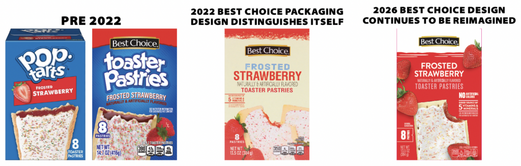
For most of Best Choice’s brand history, the goal of its product packaging was to give consumers the perception that the product was very similar to the national-brand equivalent. Best Choice packaging often closely resembled the colors, photography angles, and claims of those national brands so consumers made the connection between the two. But, in 2022, that packaging design strategy changed. Best Choice had proved its value to consumers over the years and no longer needed to have similarities to national brands for consumers to trust the brand. Plus, across the industry, private brands were moving to a cohesive brand look to be distinct and noticeable on shelf. Best Choice followed suit. When Best Choice Superior Selections rebranded to Superior Selections by Best Choice, a new look helped consumers understand the distinct nature of the elevated brand. Rich colors, a new logo, and richer photography helped set the stage for what consumers could expect from the brand.
MODERNIZATION
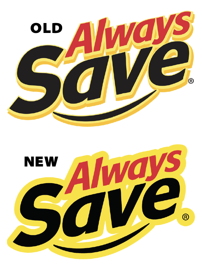
There is certainly trust that’s built over years when consumers can see the same colors, claims, and structure on product packaging. They know the products they love with a quick glance and trust that it’s the same product each time they buy it. But for consumers who have never purchased that product before, modernizing the packaging may be an invitation to try something they haven’t tried before or to try it again if it’s been a while. The Always Save brand, with its distinct yellow packaging and quirky graphics, needed modernization to update the logo, colors, and packaging claims. Some of these changes aren’t just made for aesthetic reasons. Always Save’s slightly modified new logo makes it functionally easier to use across a wide array of applications and enhances its visual consistency while also removing dated elements.
BRAND RELEVANCE
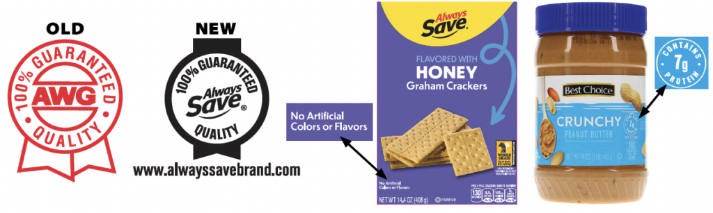
Even small updates to product packaging make an impact on consumers. Always Save’s redesigned 100% guarantee keeps it at the forefront of the brand’s promise to deliver quality. Product packaging aligns with what consumers want in that moment and can change quickly. This could be driven by regulatory changes that force cleaner formulas, or by lifestyle changes like increased protein or fiber intake that consumers are striving to achieve. Better call outs of relevant claims show consumers that products and their presentation are being thoughtfully and consistently considered. Ensuring packaging has clear product descriptions, engaging photography, and eye-catching color additionally appeals to consumer interests.
AWG isn’t alone in redesigning products. Competitors like Aldi and Walmart are in the midst of full brand redesigns as they also try to keep up with consumers and maintain relevance in private brands. Brands know consumers have lots of choices and their best shot at grabbing sales is to have their products grab as many eyes as possible.
Make sure you have the latest photos of all AWG Family of Brands items and use the AWG Image Archive at awg.canto.com/v/AWGBrands